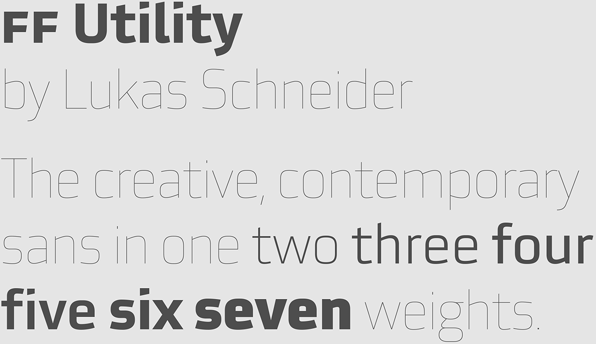


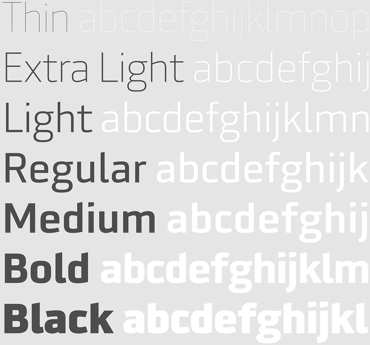
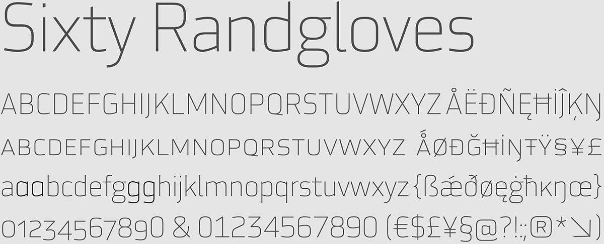
With the additon of Thin and Extra Light, the family now contains seven weights. Thin and Extra Light were designed to be set in larger sizes and work great as headlines or for display use.
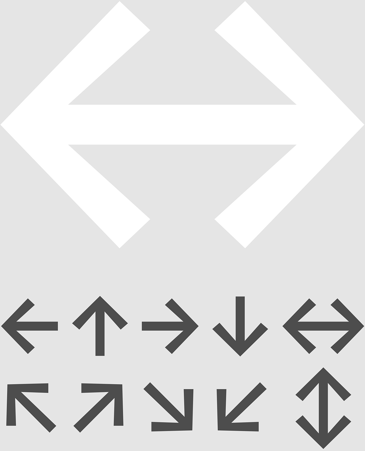
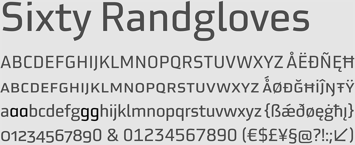
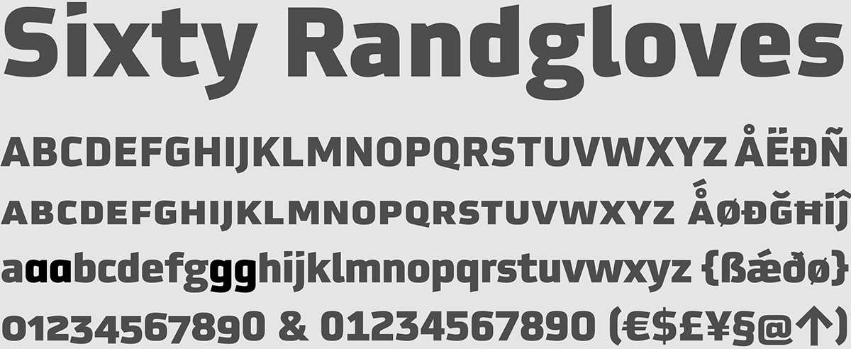
Each weight has a set of arrows

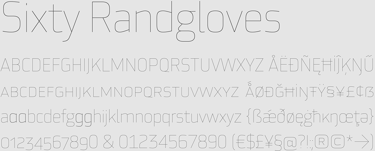
The alternative ‘a’ and ‘g’ give you the option of a more streamlined look.
FF Utility Thin
FF Utility Extra Light

FF Utility Light
FF Utility Regular

FF Utility Medium

FF Utility Bold
FF Utility Black

